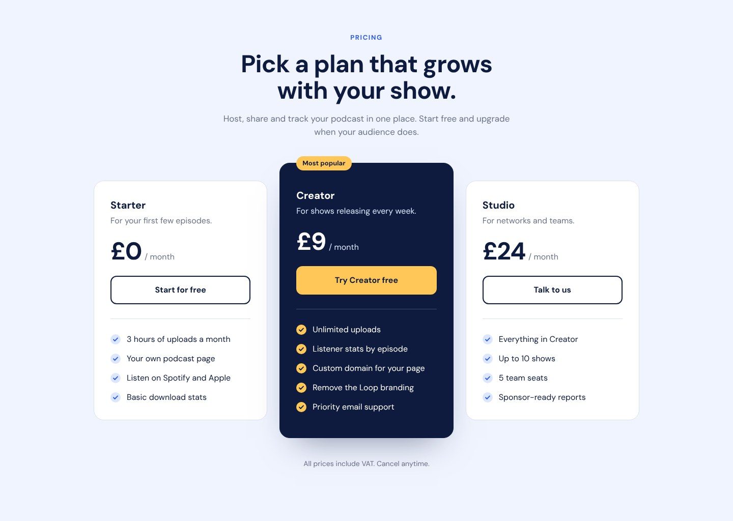
Pricing plans section
Three pricing cards for a podcast app, with a featured plan in the middle. Your first responsive layout: side by side on desktop, stacked on a phone.
The starter files include the designs, assets and everything you need to build the project. There's also a README to help you get started.
The design file for this challenge is part of Pro.
Our solution code is part of Pro.
Brief
Your challenge is to build this pricing section and get it as close to the design as you can.
Loop is a podcast hosting app. Their pricing page needs to make the middle plan the obvious choice without hiding the free one.
What to build
- A centred heading area: eyebrow, headline and a short line of text
- Three plan cards, each with a name, a short description, the price, a button and a list of features
- The middle plan, Creator, is dark, slightly taller on desktop, and has a "Most popular" badge
- On a phone the cards stack, Creator in the middle. On desktop they sit side by side.
You're done when
- It matches the design at mobile, tablet and desktop sizes
- Nothing scrolls sideways on a 375px phone
- Every button has a hover and a focus state
- Each plan's features are a real list
- It's live on a public link
Bonus
- Add a Monthly / Yearly switch with JavaScript that changes the prices
- Make the featured card lift slightly when the page loads
Download the starter and read the README.md first. The style-guide.md has the colours, fonts and sizes.
Want some support? Join the community and ask in the #help channel.
Assets provided
- Design file (Pro)
- Designs for each screen size (JPG)
- Style guide with colours, fonts and spacing
- README to help you get started
- HTML file with the content already written
- AGENTS.md so your AI assistant mentors you instead of doing it for you
Ideas to test yourself
- Build it mobile-first, then add one breakpoint where the cards fit side by side
- Use a CSS background image or a pseudo-element for the tick icons