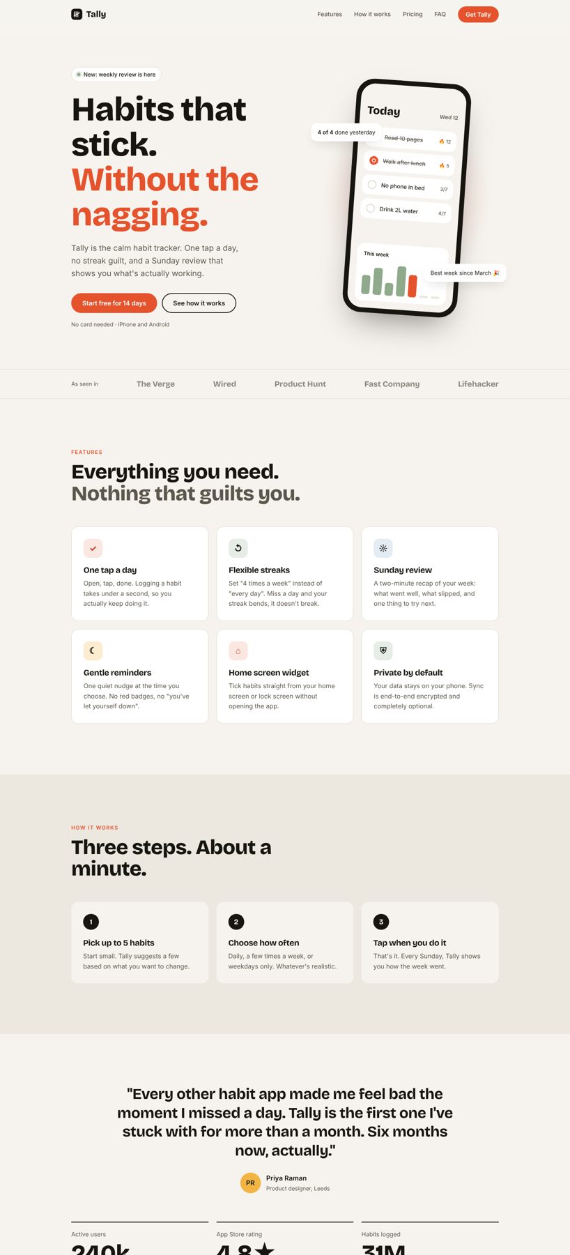
Tally: habit app landing page
Build a calm, fully responsive launch page for a habit tracker app, with a mobile menu, a pricing toggle and an FAQ. Great practice for layout across three screen sizes.
The starter files include the designs, assets and everything you need to build the project. There's also a README to help you get started.
The design file for this challenge is part of Pro.
Our solution code is part of Pro.
Brief
The client
Tally is a small app studio launching a calm habit tracker. Their whole pitch is "no guilt": flexible streaks, one tap a day, and a Sunday review. They need a launch landing page that feels warm, confident and simple, and that works perfectly on a phone because that's where their customers will see it.
"Every habit app shouts at you. We want our page to feel like the app: calm, friendly, and obvious what to do next."
What to build
One responsive landing page with these sections, in this order:
- Sticky navigation with logo, 4 links and a "Get Tally" button. On mobile it collapses into a menu button that opens and closes.
- Hero with headline, short intro, two buttons, and a phone mockup showing the app. Build the phone in HTML and CSS, not as an image.
- "As seen in" strip with 5 publication names.
- Features: 6 cards in a grid (3 across on desktop, 2 on tablet, 1 on mobile).
- How it works: 3 numbered steps.
- Testimonial with a big quote and 3 stats underneath.
- Pricing: 3 plans with a Monthly / Yearly switch that changes the prices.
- FAQ: 4 questions that open and close.
- Final call to action on a dark background, then the footer.
All copy is in the design stills. Use it as written.
Skills you'll practise
- Semantic HTML (
header,nav,main,section,article,footer) - Layout with Flexbox and CSS Grid
- Responsive design across 3 breakpoints (desktop 1440, tablet 834, mobile 390)
- Design tokens with CSS custom properties
- A small amount of JavaScript: mobile menu, pricing toggle, fade-in on scroll
- Accessibility basics: focus styles,
aria-expanded, skip link, reduced motion
Rules
- Plain HTML, CSS and JavaScript. No frameworks for this one.
- Use AI tools (Claude, Cursor, Copilot) if you want, but read and understand every line before you submit. The review checks for it.
- Match the stills as closely as you can at each of the 3 sizes.
You're done when
- It matches the design at desktop, tablet and mobile sizes
- Nothing scrolls sideways on a 390px wide phone
- The mobile menu opens, closes, and closes when you tap a link
- Monthly / Yearly changes the Plus and Family prices
- Every FAQ opens and closes, and works with the keyboard
- You can reach every link and button with Tab, and see where focus is
- Lighthouse scores 90+ for Performance and Accessibility
- It's live on a public link (Netlify, Vercel or GitHub Pages)
Bonus
- Add a dark mode that follows the visitor's system setting
- Animate the bars in the phone's "This week" chart when the hero loads
- Make the pricing toggle remember the visitor's choice
Download the starter and read the README.md first. The style-guide.md has the colours, fonts and sizes.
Want some support? Join the community and ask in the #help channel.
Assets provided
- Design file (Pro)
- Designs for each screen size (JPG)
- Style guide with colours, fonts and spacing
- README to help you get started
- HTML file with the content already written
- AGENTS.md so your AI assistant mentors you instead of doing it for you
Ideas to test yourself
- Use semantic HTML landmarks so the page reads well with a screen reader
- Build mobile-first and only add breakpoints where the layout breaks
- Keep every colour and size in CSS custom properties